Remodelling proud heritage into a forward-thinking army regiment.
Fake Empires were engaged by the regiment to help review the Royal Anglian visual and verbal identity, revitalising the proud heritage and history they're identity is built upon, with a modern, forward-thinking approach, distilling the Royal Anglian brand for the future.
We developed a refreshed brand platform to unite individual Royal Anglian battalions under a master-brand to set them apart from other units within the MoD. Giving the regiment a clear identity and a point of view that resonates with a younger audience - potential Royal Anglian recruits.
Giving the regiment a brand refresh, not total overhaul was an important part of the brief, maintaining the core elements that resonate with both current and veteran Royal Anglian’s who serve or have served the regiment with honour.

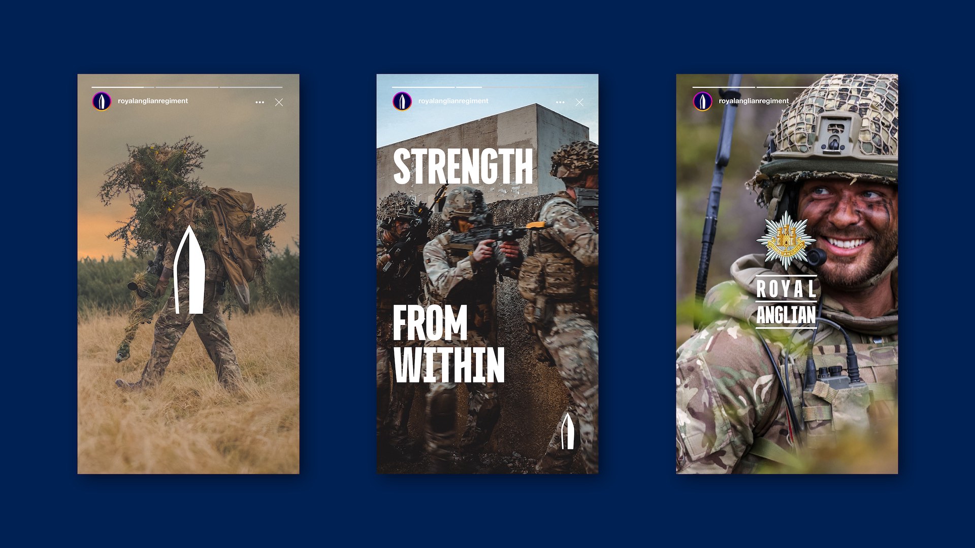
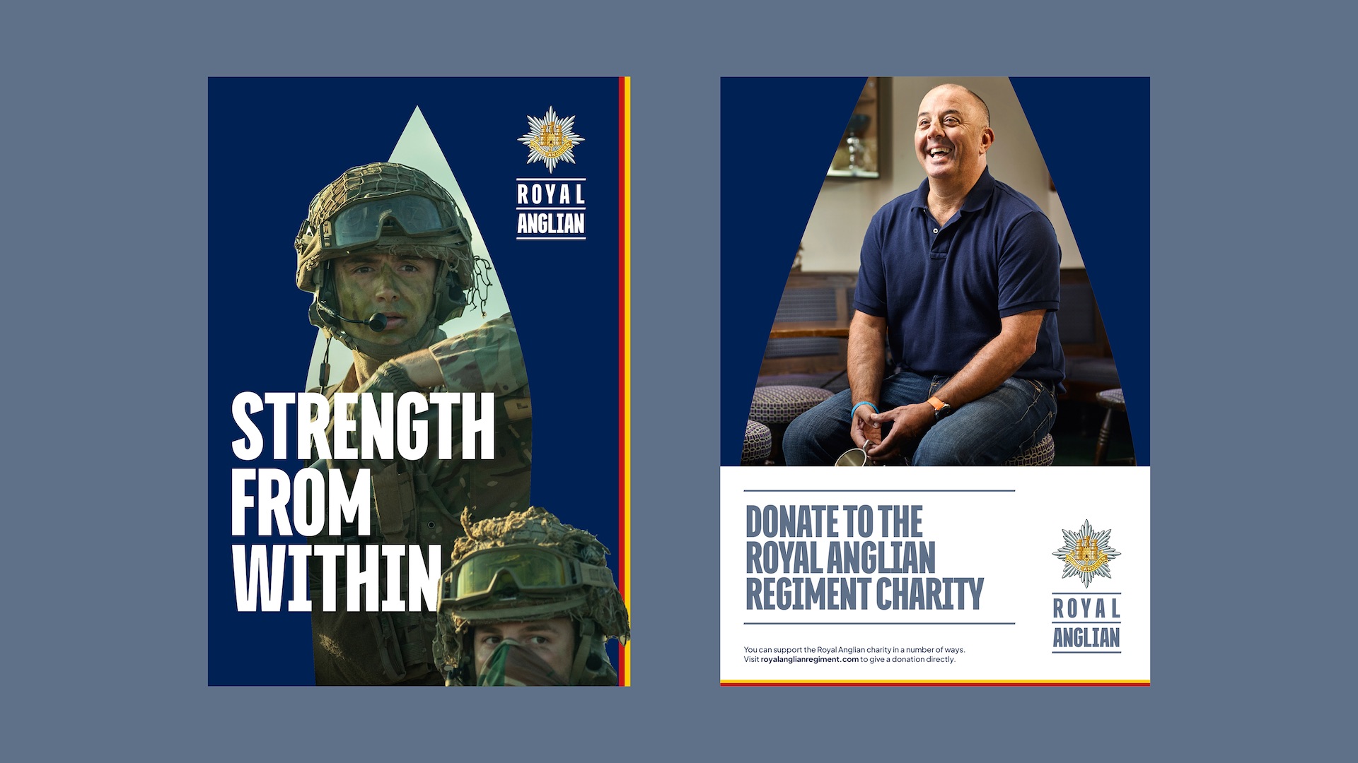
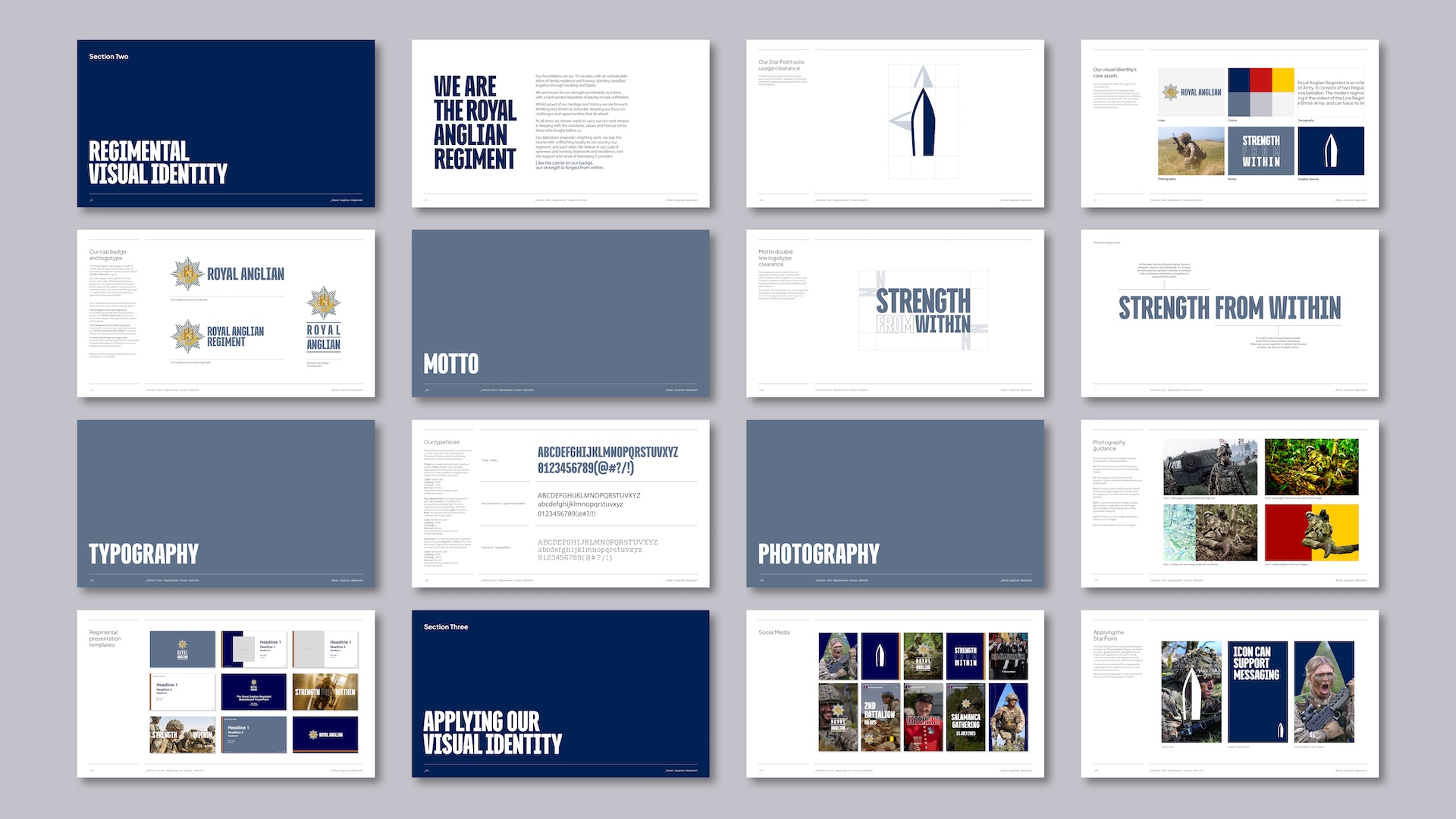
For sturdy and powerful messaging we chose Titular, a condensed sans serif typeface we customised for a unique and tailored look specifically for the Royal Anglian logotype and 'Strength From Within' motto, it’s bold, striking and full of attitude. Paired with Plus Jakarta sans a modern geometric sans serif typeface, chosen for its formal accessibility. The typographic system achieves balance between uncompromising historic character and projecting a punchy, modern image.
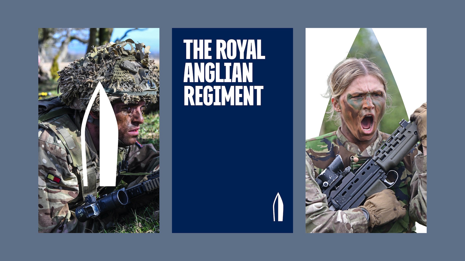
We created a graphic device derived from the most recognised asset of the Royal Anglian identity - its regimental cap badge. Our Bayonet serves as a powerful iconic signature alongside the Royal Anglian logo ensuring immediate recognition and association with the regiment. Additionally, it will be versatile enough to be utilised across all channels as a holding shape, repeated pattern, or visual sign off.
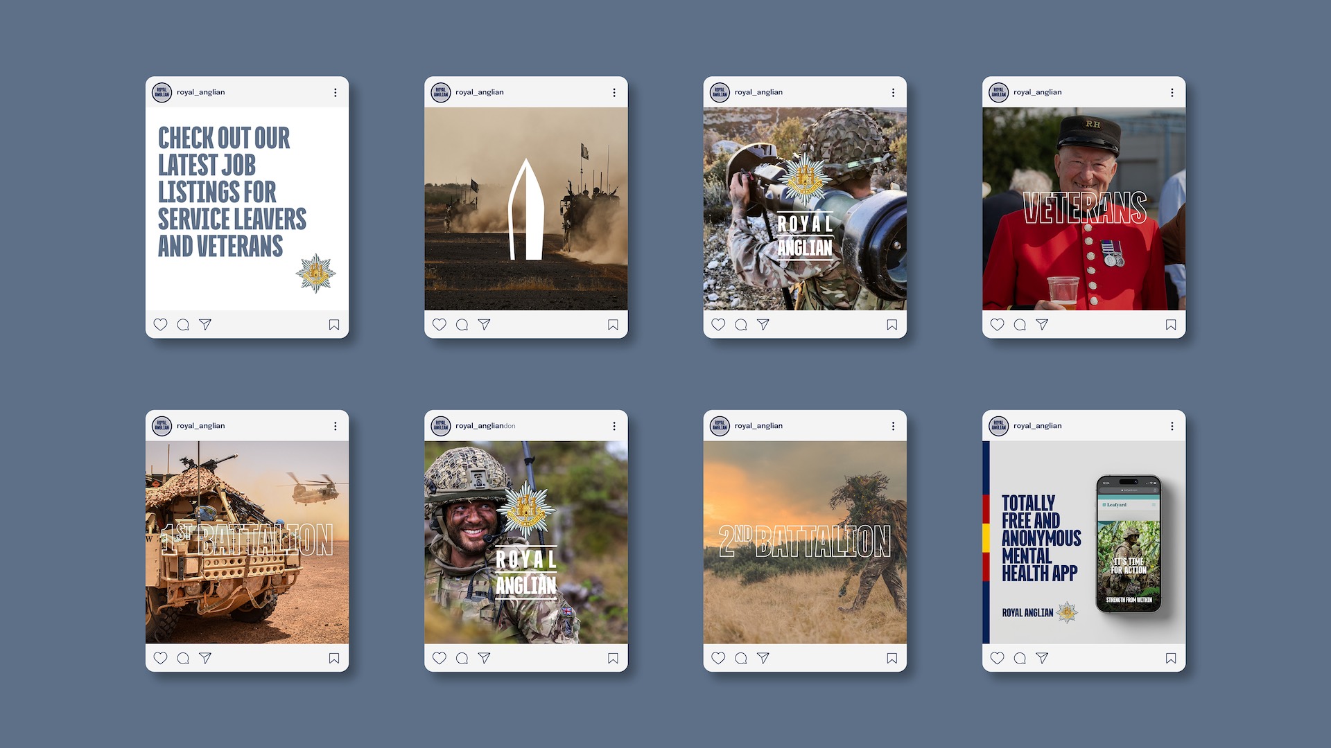
The new identity system for Royal Anglian extends across various applications to ensure a consistent and impactful visual presence including website, social media, stationary, posters, exhibition graphics, and finally way-finding signage across the regiment HQ and barracks.
Our objective of elevating comms and driving consistency was met with high praise. Issues reaching multiple audiences without a defined message or consistent identity across core channels.
I hugely appreciate your engagement and support on the project. My sincere thanks again to Tom Peters and Fake Empires Design for the craft and hard work.
Brigadier Olly Brown
Field Army Headquarters
Collaborators
Client Relations — Tom Peters
Photography — Steve Armon
Film — Steve Armon

Get in touch.
Our aim is to help your brand not only stand out from the crowd but also build enduring business relationships.