Relaunching St Lukes London as a leading player in the agency world.
Reinventing how St Lukes advertising agency presents themselves to the world. With a client roster that rivals agencies three times their size, St Lukes wanted to present themselves as a confident player in the creative agency world. Fake Empires refreshed their identity to not only reflect the agency’s vibrant culture, but also their drive and ambition to take on the big, more corporate agency networks.
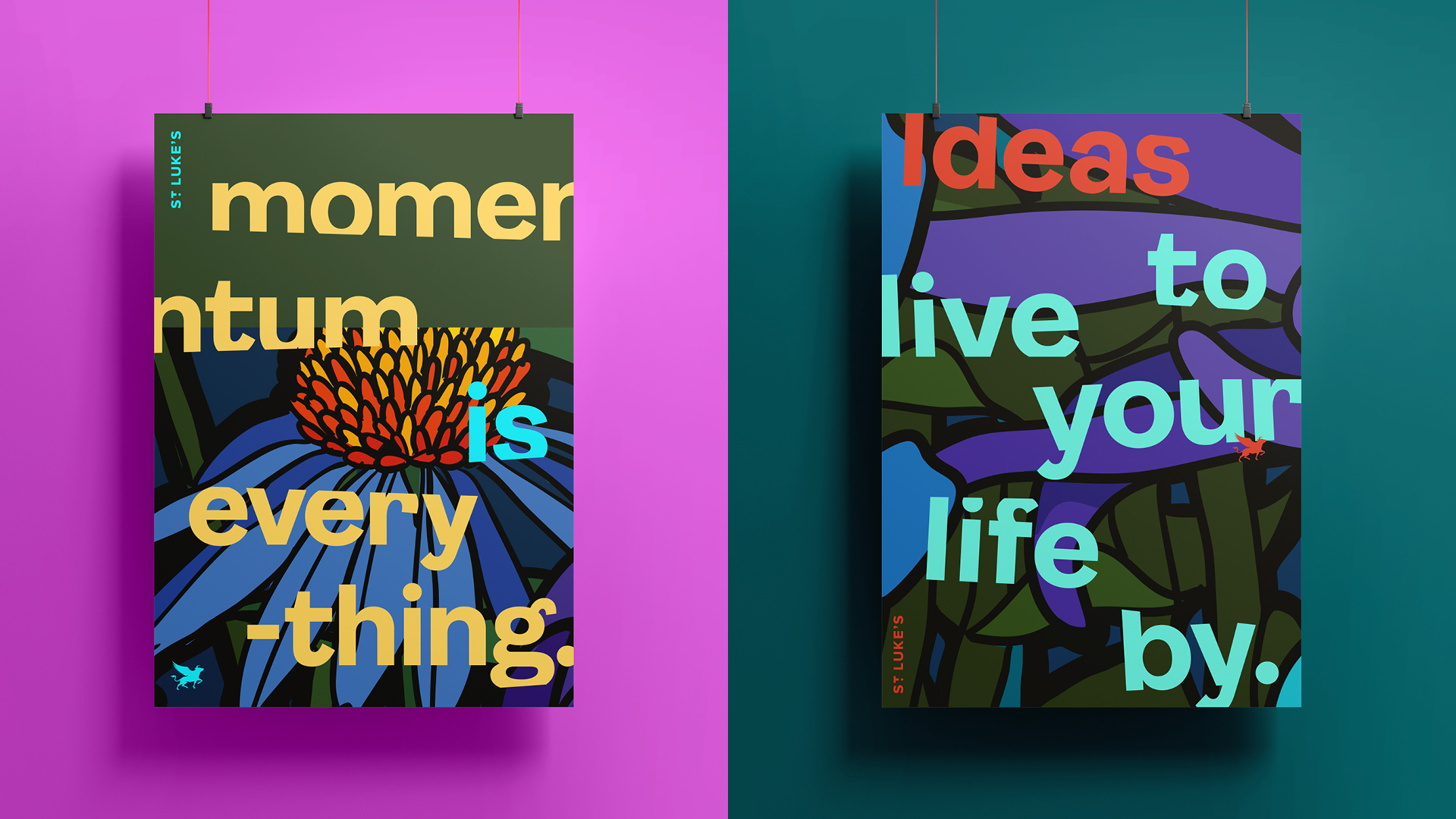
The new, colourful identity took its inspiration from the agency’s new, home of the Covent Garden flower market in the 1830s, to celebrate this St Lukes commissioned a graphic rewilding project throughout the building’s interior covering the office in floral painted murals by Lee Baker and Catherine Borowski.
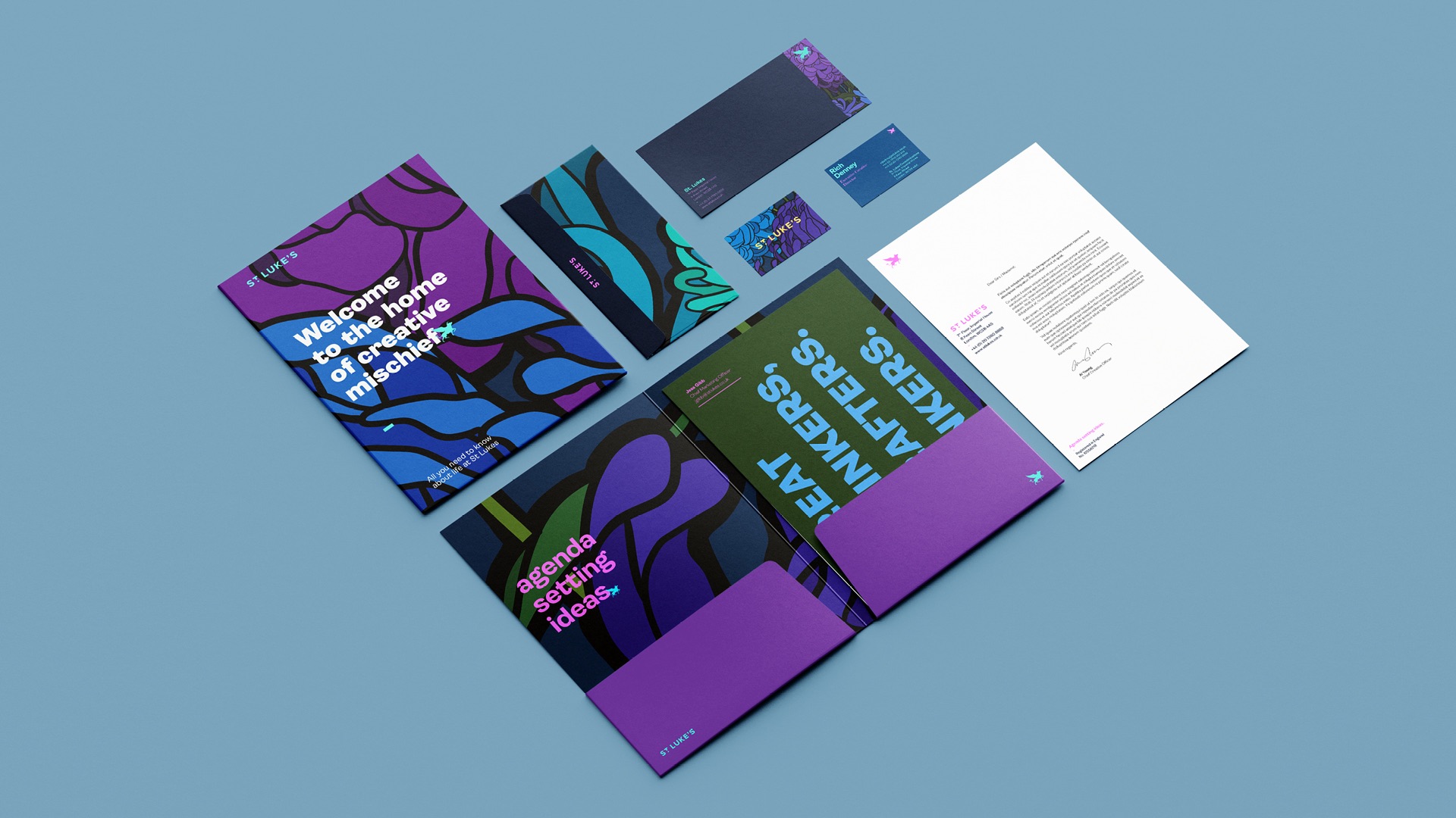
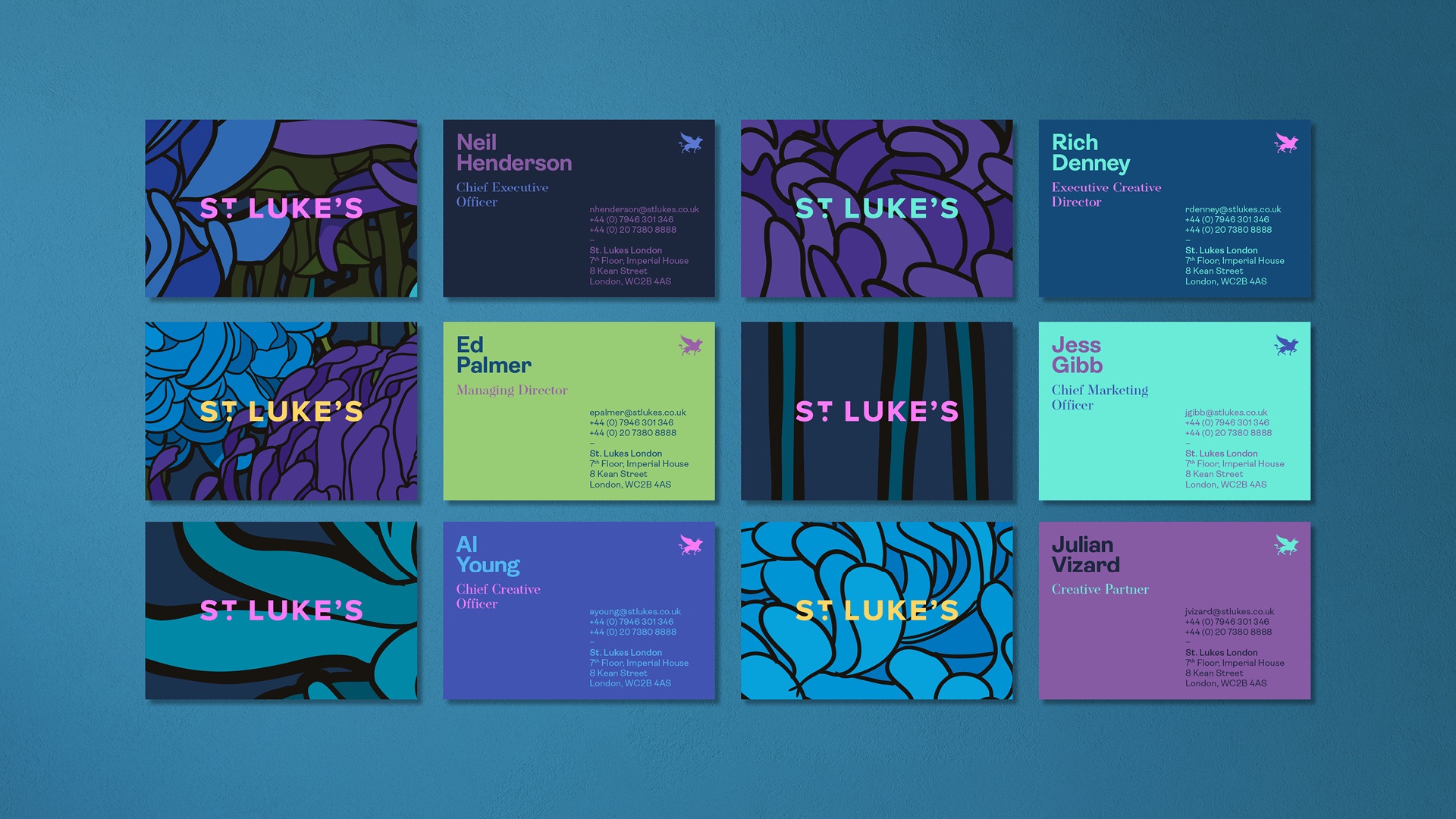
We also incorporated organic floral shapes and textures into the brand refresh for a natural, visually engaging aesthetic. A vibe that partly reflects the agency's connection to its colourful surroundings, but also symbolises the growth and creativity of its talented team. We developed a colour palette which brings energy, excitement, and a sense of vitality, pairing these colours with an eccentric and light-hearted brand typeface. We chose Ambit with its distinctive curly letterforms to evoke positive emotions, reflecting the agency's lively creative spirit, while ensuring that key messages are clear and memorable.
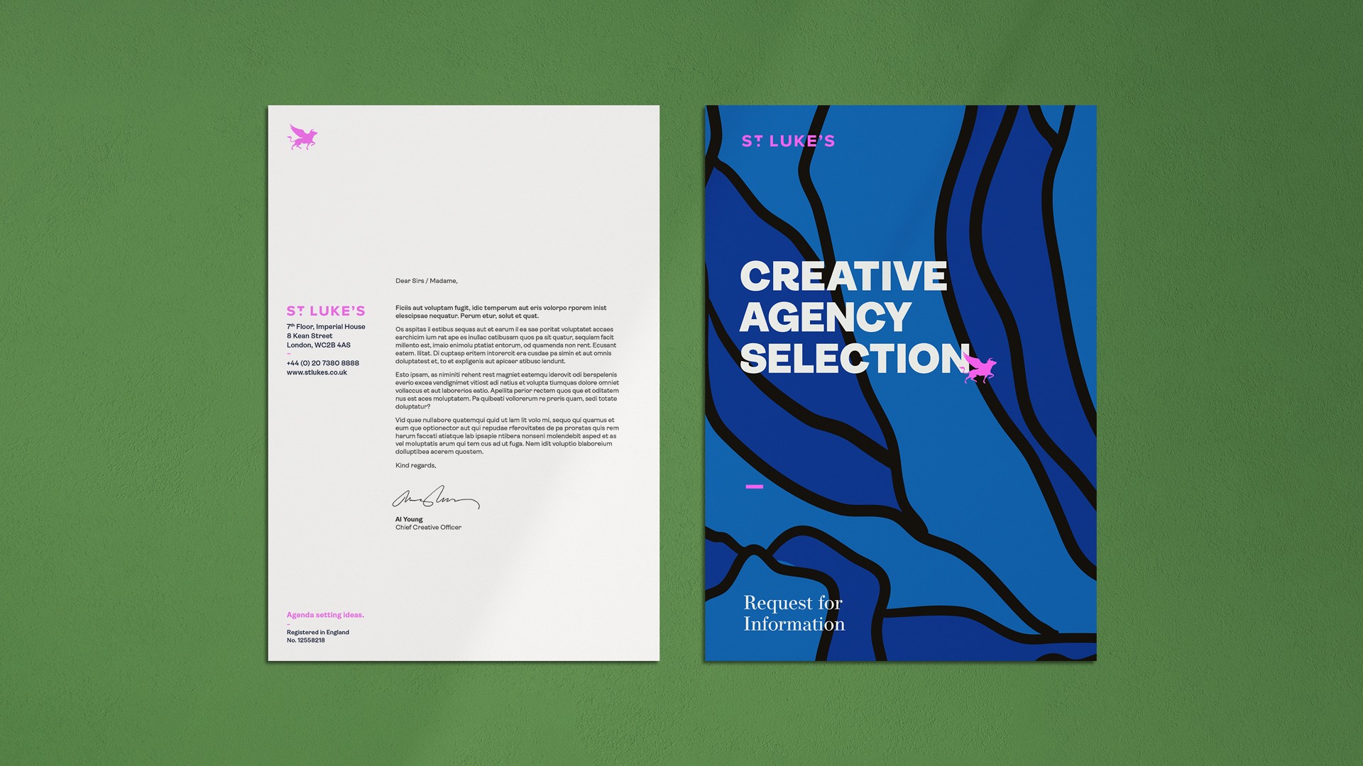
Our rich and vibrant design system for St Lukes was then developed across a wide range of touch-points to ensure a cohesive and unified brand experience across all internal and outward-facing communications.

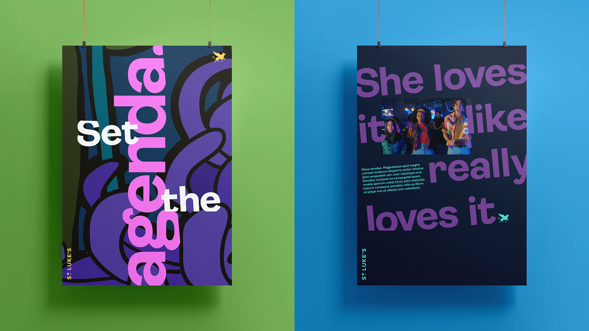
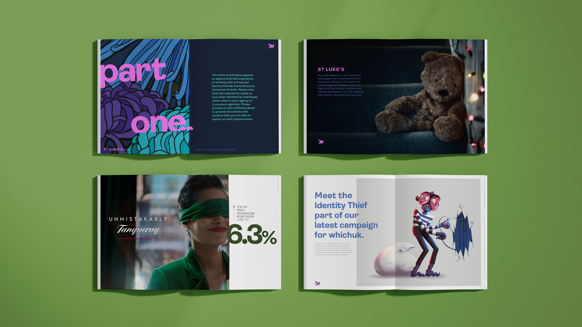
This included house stationary, website, presentations slides, reel graphics and social media. We also had some fun applying the new mischievous tone of voice and daring attitude across promotional material such as posters, tote bags, and branded diaries. Creating agency stand out and making a memorable impression on potential clients and talent.

Get in touch.
Our aim is to help your brand not only stand out from the crowd but also build enduring business relationships.